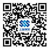
The brand logo is formed of three English letters, which stand respectively for Shanghai, security and service. The letter ‘S’ evolves from the dragon design, which, in ancient China, acquires an implication of warding off evils and providing protection and which highlights the characteristic of the profession of security. The composition of ‘SSS’ signifies three shields closely put together. And also, its exterior round shape and interior square shape symbolize the rigorous and surefooted working style, the team spirit of pragmatism, the philosophy of affinity to people, and the principle of serving the general public of the society as displayed by Shanghai Security Service Corporation.
The combination of blue, light blue and deep blue constitutes the principal tone in the application of colors, which gives a strong sense of impressiveness and modernity. The exterior deep blue delivers a message of calmness and sensibility, representing the firm professional image of Shanghai Security Service Corporation, whereas the interior light blue transmits a sense of steadiness and intelligence, an embodiment of the intelligence and human cares that are deeply rooted in Shanghai Security Service Corporation.
The sharp angles in each ‘S’ have been intricately addressed in such a way as they are replaced by rounded angles to avoid a ‘stiff and pointed’ feeling, which helps to make prominent the basic characteristic of the internal strength and the external affinity of Shanghai Security Service Corporation as redefined by the implication of ‘round exterior and square interior, soft exterior and hard interior’.


: Security, Super-quality, High-efficiency, Speed
:Unity, Endeavor, Super-quality, High-efficiency
: Security First, Quality Service, Contract Abiding, Prestige Foremost